Proud to announce I’m publishing my first Qlik Sense extension.
Is it a grid chart or a waffle chart?
https://github.com/RichardPearce60/sense-svg-grid-chart
This isn’t my first extension, over the past few years I’ve been enhancing my web language experience learning JavaScript and several library’s (D3, require, angular, lodash, etc).
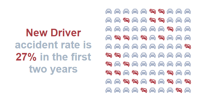
I took my inspiration for this chart from one I saw on the BBC news website. The concept is simple enough and the idea of such a chart is to give more cognisant representation of the data. In the example above we can see how many cars in 100 are in an accident each year.
ObservableHQ Prototype
Although the concept was simple there were still a number of challenges to overcome and these were done using observableHQ, this site is typically where D3 users can create Notebooks, these stories allow developers to convey ideas, solutions an collaborate with others.
Key challenges were:
- How set the colour of the SVG Icon
- How to calculate the grid size
- How to calculate the position of each Icon
- How to set CSS variables using JavaScript
What I try to do now in observable is still keep Qlik in mind when so when I’m finally ready to move to Qlik Sense the code needs little or no altering.
I look forward to hearing your feedback and if you feel like contributing then please make a pull request.
Take care
Richard
