Taking your first steps into Qlik Sense extension development can be daunting. With limited training materials dedicated to that task the learning curve is not only steep, its also a complex investigation with numerous help files, examples and blogs. Its like you’re a detective in a crime and you don’t even know what crime has been committed.
You have to get old school in your development skills. Back to the basics of debugging, moving slowly making small increments and check the code works as you go breaking down large developments into bite size chuck (It will get easier) and ensuring any code you ‘borrow’ you find out exactly what its doing
First Steps…..
Take you time to learn basic fundamentals of extension building using the Qlik help guides. Doing the qlik help ‘Hello World’ example from scratch isn’t very exciting but you do learn things. Eventually you’ll work with data.
Progress through the help tutorials all the way to ‘Working with data‘. This was such a great post although I struggled to find the matrix information in the console logger! Until I deleted the extension from the Qlik sheet and dragged it back in again! It then worked.
This was a learning curve to ensure I always checked simple things like this each time I hit a snag. For example restarting Qlik Sense Desktop (or re-importing the app into the QMC), adding it back into the sheet as a new extension (which probably clears the memory cache). Also if you hold shift down when you reload the web page on Chrome you get three options: ‘Normal Reload’, ‘Hard Reload’ & ‘Empty Cache and Hard Reload’. The latter ensures there’s no saved information from a previous version of your extension which maybe causing you problems.
Simple Development Best Practice and Debugging Tips
- Import the extension every time when you add a new file if working on a server or close and restart the Qlik Sense desktop app.
- If you are using the Qlik Sense desktop application then have it running in the back ground and work in Chrome browser using the web address http://localhost:4848/hub/my/work
- Use a good text editing program such at Atom or Notepad++ (don’t used basic Notepad or the DevHub editors!)
Some of the Qlik help lessons had issues, copy and pasting the information didn’t always work. I had to write it in step by step and constantly test each line to see where the bugs area:
- Using the console.log function then by pressing F12 in Chrome you enter the development area and the ‘Console tab’ will output these log statements. Very much like Trace would in Qlik.
- There’s also a Source tab in the Chrome developement area, after you’ve loaded the script once (even if it has failed) you can view the code and add breakpoints. If you then reload the web page the code will stop at your breakpoints and by using your mouse hover you can investigate object properties in the code which may be causing an issue.

Console Logging
Standard procedures if the code isn’t working (before you blame the actual code):
- Restarting Qlik Sense Desktop (if you’re using it) or re-import the extension into Qlik via the QMC
- Delete the extension from the Qlik Sense sheet and adding it back in again (set up all the properties from new)
- Do a ‘Empty Cache and Hard Reload’ on Chrome (hold shift key)
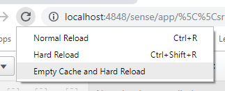
Shift and Refresh
Using JS visualisation library’s
When working through the ‘Hello Data‘ help topic in Qlik you’ll start to understand the hypercube matrix which is a real game changer. Although the actual visualisation is just a basic HTML table and not the beautiful chart you were longing to create, we need to move on.
For that you need to look elsewhere… Qlik are adamant that they’re not in the business of helping you learn JavaScript so you’re kind of on your own in that respect and you have loads of options; D3 or the library’s build on it such as Picasso.js or Chart.js (to name but a couple, there are loads!!!).
- Picasso.js (I understand) was developed by Qlik in order to be a fast route into visualisation building. So its simple to use but also limited (kinda like Qlik Sense in that respect and that why we’re learning how to build extensions). Make no mistake though its a stand alone product and not linked in any way.
- Chart.js is open source, loads of people contribute to the project on GitHub, creating more features and fixing bugs.
You have to choose which library to go for (although you can learn them all if you want). Fundamentally they’re very similar.
Firstly though I would recommenced you follow the tutorial in Picasso.js, this takes you through the steps of building a simple plot chart. At each stage you can play with the code in another website called JSFiddle. This is a great website for playing around with chart options because its responsive. Change the point colour in the code and straight away you can see how it looks using sample data. The Picasso tutorial is certainly worth working through but following that I decided to focus on Chart.js for no other reason as I thought I could get more out of it in the long run (total guess on my part).
Chart.js doesn’t have a tutorial but it has examples and documentation, the examples you can copy in to JSFiddle and start playing with them (see below), the Picasso tutorial will serve you well in understanding the basic structure of the JavaScript program.
When moving a Chart.js example into JSFiddle you have to think on your feet now if you’re new to web design and javascript. You can’t just go to the line chart and copy it in. You have to set up the HTML so it knows what its doing.
To help you get there quickly below is the code the you can copy into JS Fiddle and you can also find a simpler version online, from here you can use code from the Chart.JS website and build up any chart you desire (although I’d keep it fairly simple to start):
HTML Section:
<canvas id="myChart"></canvas><script src="https://cdnjs.cloudflare.com/ajax/libs/Chart.js/2.4.0/Chart.min.js"></script>JavaScript Section:
var ctx = document.getElementById("myChart").getContext('2d');
var myChart = new Chart(ctx, {
type: 'bar',
data: {
labels: ["Red", "Blue", "Yellow", "Green", "Purple", "Orange"],
datasets: [{
label: '# of Votes',
data: [12, 19, 3, 15, 2, 3],
backgroundColor: [
'rgba(255, 99, 132, 0.2)',
'rgba(54, 162, 235, 0.2)',
'rgba(255, 206, 86, 0.2)',
'rgba(75, 192, 192, 0.2)',
'rgba(153, 102, 255, 0.2)',
'rgba(255, 159, 64, 0.2)'
],
borderColor: [
'rgba(255,99,132,1)',
'rgba(54, 162, 235, 1)',
'rgba(255, 206, 86, 1)',
'rgba(75, 192, 192, 1)',
'rgba(153, 102, 255, 1)',
'rgba(255, 159, 64, 1)'
],
borderWidth: 1
}]
},
options: {
scales: {
yAxes: [{
ticks: {
beginAtZero:true
}
}]
}
}
});

JSFiddle output
Now you know the basic set up its easy to start playing with the options and quickly seeing the results.
In the HTML section the line: <script src="https://cdnjs.cloudflare.com/ajax/libs/Chart.js/2.4.0/Chart.min.js"></script> is essential in telling the browser where to get where to go on the web so it can understand the ‘chart()’ function.
Here we’re linking to a website although in Qlik Sense extension its probably best if we get the file downloaded locally so we can control when we get a new version. I downloaded the chart.js file directly from GitHub page although you have many options on how to achieve this if you check the installation page in the chart.js help documentation.
The Next Big Step
Now we have a challenge! We can load data from Qlik Sense in to a hypercube and we can fiddle around with the chart.js library options and making the visualisation look amazing. The next step is to combine the two….. and its this information I think is missing from tutorial blogs out there at the moment. This is what I did………
Firstly via Qlik Branch I found an extension which used chart.js (https://developer.qlik.com/garden/576bab2754cc348900aeb122), this is an amazing piece of work created by Masaki Hamano. Its a single extension that via property selections the user can control loads of the Chart.JS properties (and on any chart type – wow!!!).
I used this as a starting point to work backwards. From my newly found experience in working with extension projects once I downloaded the github project I was able to identify the files and pulling out just what I needed (from the src folder only!) I imported the extension into Qlik Sense and made sure it worked okay before I continued any further.
Hint – I added a console.log (‘Hello’) into the js files so I could see them being ran in the F12 Developer console
From there I could see where the chart.js file was saved (in the js folder), I could see how the main JavaScript code file referenced that file and others (although I was only interested in my properties.js and chart.js files)

ChartJS Include Code
I knew how to create a hyper cube and refer to it.
var hc = layout.qHyperCube;
console.log ('Data returned: ',hc)
I knew how to create a Paint function and in there I pasted in a Chart.JS example line chart complete with its own hard coded data. I just wanted to make sure both elements worked. The data ingest which I could see worked with the console.log function (above) and I knew the paint chart method work because I could see the chart in Qlik Sense just like I could see it in JSFiddle.
Now this didn’t happen straight away. I had to bring in code slowly, checking all the while with my F12 Chrome Developer tools (Console / Sources), I also referred to the online help for Qlik API’s, JavaScript, Chart.js and very often the large chart.js extension I downloaded from Masaki Hamano.
I looked to see what they did, tracking back variables to see where they came from, breaking it down and simplifying the code so it worked and by doing so I could understand it. My challenge was to change the data properties from a hard coded set of arrays to a variable array loaded with data from Qlik Sense.
Ultimately I change the scope (snippet) from this original Chart.JS fiddle:
data: {
labels: ["January", "February", "March", "April"],
datasets: [0, 10, 5, 2],
},
to this:
var hc = layout.qHyperCube;
var dataValues = hc.qDataPages[0].qMatrix.map(function(d) { return { y: d[1].qNum } })
var dataLabels = hc.qDataPages[0].qMatrix.map(function(d) { return d[0].qText; })

...

data: {
labels: dataLabels,
datasets: dataValues
},

Final Extension Chart
Dimension labels and the y axis values are now coming from the Qlik Sense qHyperCube!!!
There’s still more for me to do and learn, of course there is and I don’t see that stopping any time soon. This is a great step forward though and gives me a simple foundation to build on. I can keep challenging myself with next steps such as working with multiple dimensions and measures or visually I’d love to be able to add another chart in to the tool tips!
I hope this had been helpful. I’ve placed the final extension bundle shown above in my github account if it helps…
All the best! R
PS – I’d saying thank you to Masaki Hamano by leaving their code open it allowed me to inspect and learn from it. I’d also like to mention the Websy Academy as their courses helped with some foundation understanding of various languages. I’d also like to thank Ryan Arpe for giving me hints and tips along the way!
