Hi
In a previous post I talked about the QlikView Engine and Explained Symbol and Data tables…….
When selections are made on a QlikView dashboard you see the Green, Grey and White displayed. In the background QlikView is using the Symbol and Data tables to understand which values are associated and which are not. Its worth just taking a moment to recap on those famous Green, Grey and White selection options and how they work.
- Every field value is either Selected or Not Selected
- Every field value is either Possible or Not Possible
- These two state are independent!
| Possible | Not Possible | |
| Selected | Selected | Selected Excluded |
| Not Selected | Optional | Excluded |
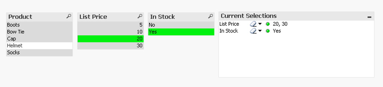
QlikView Selections Made
For example here we have selections in two fields.
- List Price = 20 and In Stock = Yes are Selected
- List Price = 30 is Selected Excluded
- Procuct = Helmet is Optional
- All the rest are Excluded
Every time you make a selection these are calculate in the Symbol tables within a new field called State Vectors. Here you can see this in action for the List Price Symbol Table. The Set column denotes the selections made. The Data table doesn’t have Set information, only the Possible State Vectors.
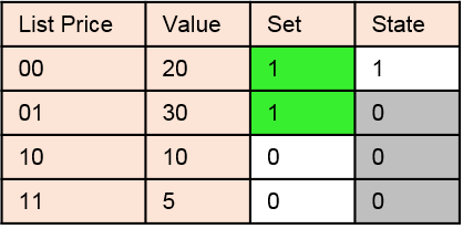
QlikView Symbol Table Selections
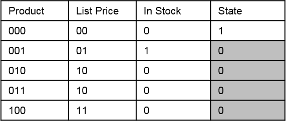
QlikView Data Selections
In my next post (in this series) I will talk about how QlikView uses these tables when calculating an expression using Set Analysis.
Happy Qliking!
Richard

Very interesting!
LikeLike
Pingback: How does Set Analysis Work in QlikView | qlikcentral·