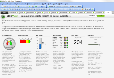
An install of QlikView comes with a number of resources often forgotten about. One of these is the Data Visualization Dashboard.
QlikView developers can, regardless of experience, become stuck in a rut. Using the same charts and techniques time after time, Bar Chart, Line Chart, Straight Table, etc. I think its really good practice to open up this document at least once per new development and give yourself the opportunity to reflect on the visualisations you have offered your customer.
The Data Visualization QlikView Dashboard has several tabs splitting the offerings into categories. Some being data types and some being chart types:
Data
- Comparison
- Units
- Movements
- Ratio
- Share
- Trends
- Relationships
Chart Types
- Trellis
- Tables
- Butterfly
- Sparklines
- KPI
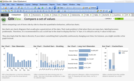
For instance one of the first charts you may add in to your dashboard is Sales over Time which is a standard bar chart you’ve included many times before. Looks good but if you take a moment to browse through the Data Visualization Dashboard you will come across ideas on how to improve this staple chart.
Here we can see our bar chart on the left. The second chart shows how this can be advanced into something more useful. By adding a new expression calculating the total sales we can now compare how selected data’s sales is performing in comparison to the whole.
The next step would be to include some more variations you create or discover, Bullet charts for example, and include them in the Data Visualization Dashboard for future reference
The Data Visualization Dashboard can be found here “C:\Program Files\QlikView\Examples\Documents”
Happy Qliking
Richard


