Last week at the Qlik Sense roadshow in Manchester I brought to an end a couple of months of Qlik seminars and conferences here, in London and around the world.
So what have I learned?
Qlik Sense V3 which was launched last week has to be the key exciting bit of news. There’s a lot of new stuff in there (too much to list) although the key thing for me is the new search functionality. Before you could search values within your data, now you can search your application for related objects and bring them together into what can be best described as a new sheet which is totally bespoke.
Search has become a powerful tool in our daily lives and if I’m honest the search functionality within Qlik has not been thrust to the front by developers. Usually it’s out of the way in a bit of free space you may have left somewhere on the sheet. Instead developers used a large portion of the screen to create list box’s for key fields.
Now developers need to change their approach to dashboard design. Limit or even totally remove the list boxes and guide our dashboard users to the search function.
Qlik Sense is all about the visualizations and we as developers also need to consider how users are accessing their data. Now we’re moving more and more towards tablets and of course smart phones. If you were to litter your sheets with multiple list boxes ask yourself the question, “How will that look on other devices?”. A phone would try and render each list box separately, that would get annoying fast.
A fresh look is best,
- Try a landing page with just three KPI objects, a company logo and perhaps an image that best describes what the business is doing or making.
- On each sheet try leaving a gap on the grid between every object and the sheet edges.
- Remove the list boxes
- Think symmetrical as you position your charts, left right, top bottom or four quadrants (remember the gap!)
- Add a KPI object to each trend analysis sheet, as users make selections they can see how it affects the bottom line
- If you need more charts use more sheets and don’t over populate
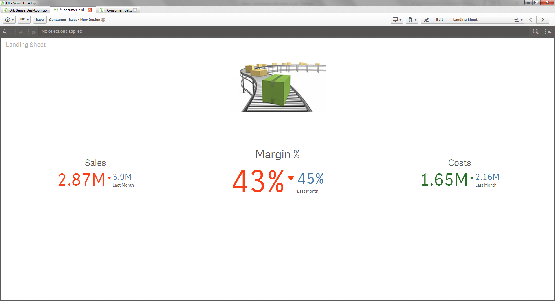
Qlik Sense Landing Page
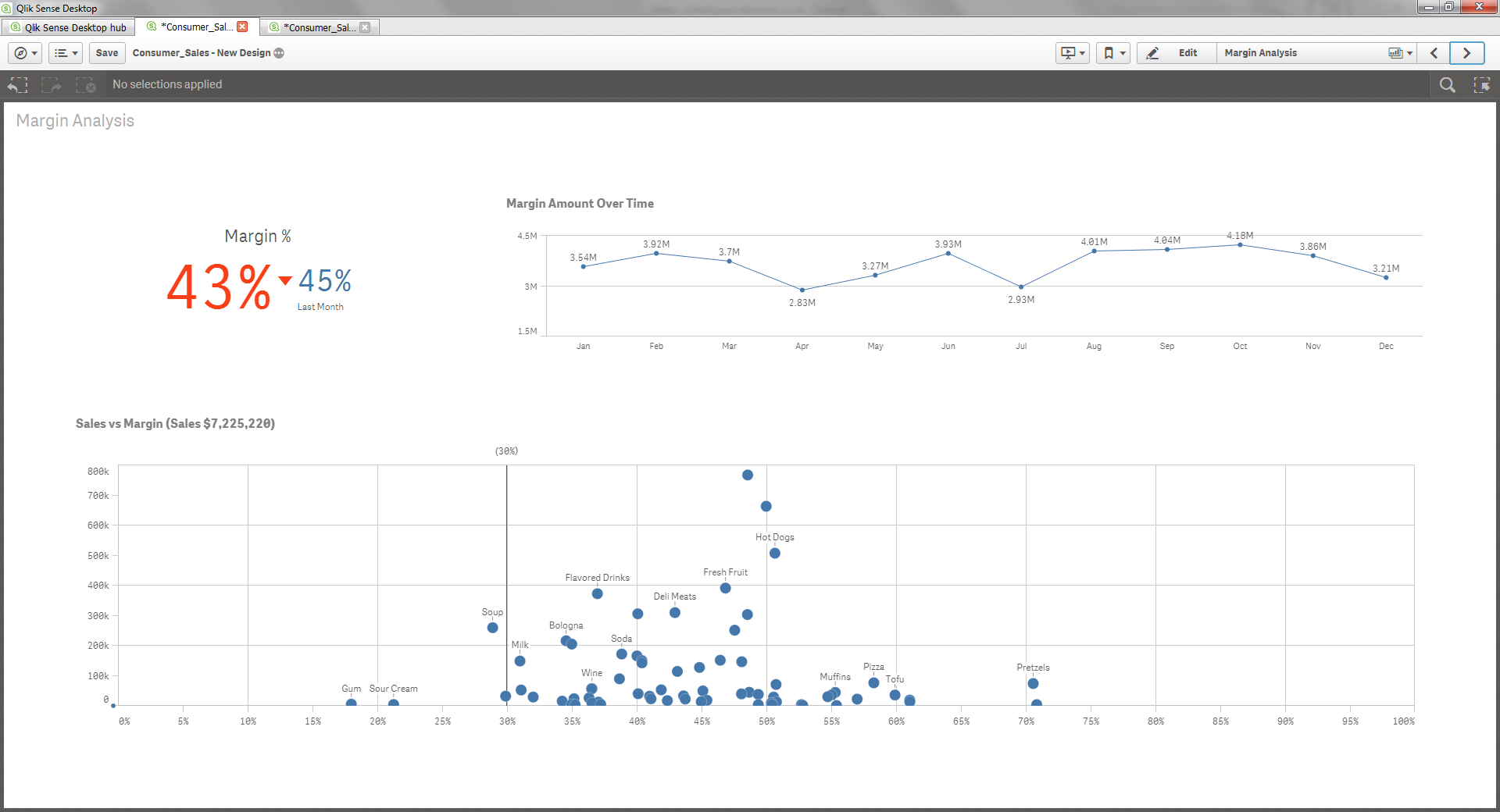
Qlik Sense Design
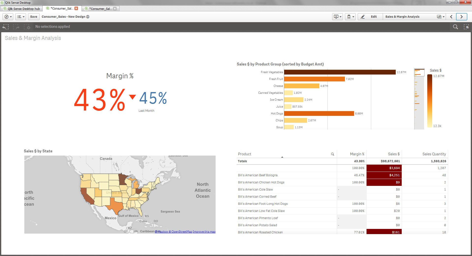
Qlik Sense Design
A final thought on list boxes, they do have a use when you want to utilize the Green, White and Gray’s of Qlik. For me though that’s the only reason why you’d implement a list box and it would be expanded on the sheet in order for you to immediately see the value of field values that don’t have an association with what’s been selected.
Also, remember you have the field selection button next to the search icon. This will change the view and allow you see, search and select all your dimensions within your application!
Ready to remove the list box’s now and embrace the search?
I hope you found this useful and as always I’d love to hear your thoughts and comments on the ideas I’ve put forward here.
Take care
Richard.

I will. Thanks. U2
LikeLike
Lovin’ this Richard. Less is More!
LikeLike