I was helping a customer recently when I was shown a Pie Chart they had developed in QlikSense showing product returns, they liked the chart although they asked how they could include the total sales price in the dimension labels because if you have a high return rate for a low selling item it’s not that bad (context is very important).
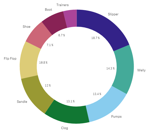
Sense Pie Chart
In QlikView you could use a Dual function to add extra information. Rather than simply saying that couldn’t be done I suggested a Scatter Plot Chart. I use these as often as I can and they’re perfect for this type of requirement. Before we look at that I first would like to talk about Pie Charts and why they are my least favourite chart.
In this example I have nine products, I can see that Slippers are the largest group and Trainers are the smallest but comparing them is pretty much impossible. Really the only time I believe you should use Pie Charts are when you only have two possible options; Male or Female for example and if you did then use a Pie Chart you’d be taking up a lot of space for two simple numbers! A KPI object would a far better option. So Pie Charts are pretty much useless (feel free to challenge me on this).
When you have more than two dimensions I’d always use the trusty bar chart.
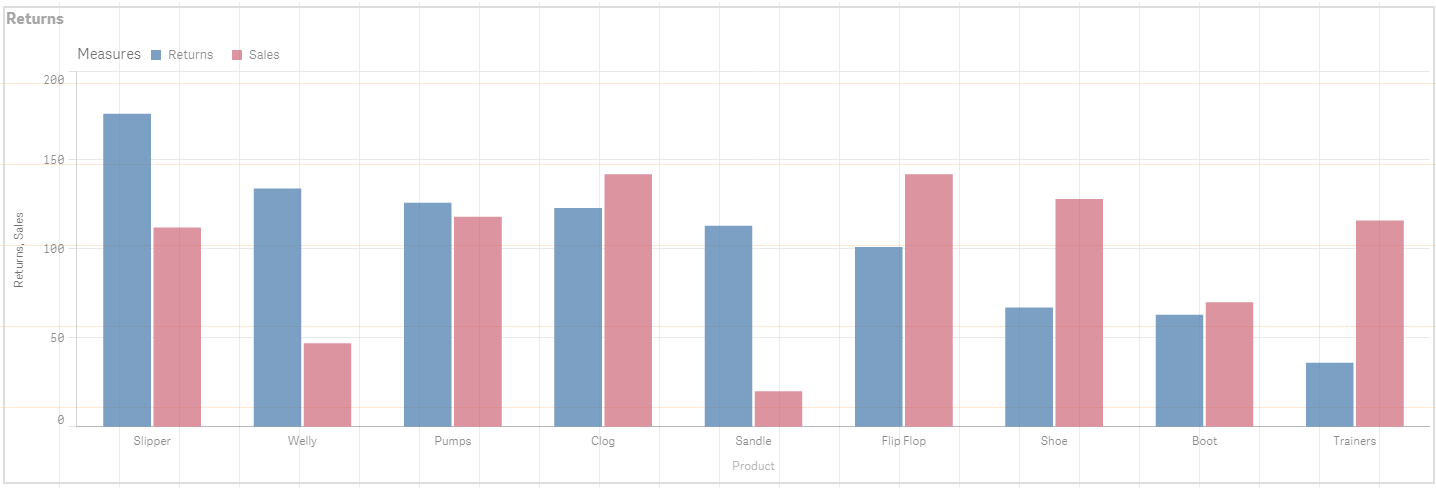
QlikSense Bar Chart
Here I’ve added the extra information requested. Now you can see both the number of return (could as easily be a percentage on the second axis) and the number of Sales. Comparisons are better and you’ve got the extra information you need although gaining insight from this chart is still quite difficult.
Scatter Charts in Qlik Sense are very easy to develop and are perfect for this type of Analysis. They also have the added bonus of being able to effectily display many more data points so you can analyse your information at a more granular level.

QlikSense Scatter Plot Chart
- The Product is the Dimension
- Sales is the first expression
- Returns % is the second
- Item Sale Price is the third (Bubble size) – I added this extra one to give further context.
Clog and FlipFlop performance stands out more in the Scatter Plot chart than they did in the Pie or Bar chart and that’s because Welly and Pumps, which don’t sell as many, had a slightly higher return rate took the focus away from Clog and FlipFlop. We can now concentrate on the products that require attention. In this example they are in the top right quadrant.
Some people find this confusing when they first encounter a scatter plot chart, these types of charts (unlike bar or pie charts) need a bit of thought because they aren’t sorted in the same way people are used to, Big one first!
You can get around this initial confusion by remembering to add help text on the screen and also by developing a help story. (Stories in Qlik Sense are typically used to create presentations, you can use them to add help taking them through the dashboard and how it works with plenty of notation).
I hope this help,
As always I love to hear your comments, if you think there’s a better way or if you think Pie-Charts are good then please share!
Richard

I like pie charts too, but with many colors, like a mexican poncho
LikeLike
Scatter plots are usually the best way to really get under the skin of multiple expressions.
If you can put a cycle group on both axis and use buttons to inject one of a selection of expressions (or select them from a data island, or use an expression cycle) then you have a really awesome data discovery object.
Thanks for sharing.
LikeLiked by 1 person
Totally agree with Steve’s comment. I’m developing a corporate dashboard template for my organisation and want to include user defined charts as key objects. I have used Richard’s methodology re data dictionary for dimensions and expressions and loading as data islands. So now intend to include a scatter chart with cycle groups to do exactly that – so when the developer discusses user requirements with the business they can show how versatile such an object is.
Thanks guys
Elliot
LikeLike