Hello,
First of all apologies for not posting any technical blogs for a while. A combination of a new QlikView role, Christmas and preparing to move house has meant I’ve not been able to give as much time as I’d liked to QlikCentral. I promise more posts soon!
Yesterday I noticed a blog post by Dalton Ruer on the Qlik Community web site with a great Heat Map visual which got me thinking.
Qlik Visualizing the busy-ness
In his post he talked about how to make information stand out to the user. Sometimes a standard chart or table just doesn’t cut the mustard or quickly becomes too busy to be effective. That’s where a heat map can help.
I’ve used heatmap styles before, typically on charts to show an extra calculation without creating more data points. A nonsense example of this could be a bar chart showing the total sum of sales for each month. Now lets say you wanted to show the percentage of those sales made in the first half of the month (I did say it was nonsense). You could of course add an extra data point and make it a combo chart, or you could use a heatmap to direct peoples view.

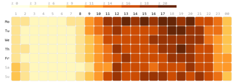
QlikView Heatmap
The heatmap chart is showing two months where they bars are hottest and three which are cool, the rest look very similar (middle range). Subjectively the left hand chart in more precise than the heatmap which just gives an indication and the heatmap works best when there’s a broad spread of data values from 0-100%.
Patrik Lundblad spoke at the last Qlik Developer Group event in January around what types of visualisation works best and colours were not high in the list, that said they can be used to show an additional piece of information. Scatter charts for example have a limit with position and size. Adding colour gives the user more context in the same space.

QlikView Scatter Chart
Percentages are the easiest thing to create a heat map with. You can fix them between 0-100% and apply the colour banding (as I’ve described below). However this scatter chart is showing totals and the range can be modified by the user with a slider object.
One thing you do have to consider is the type of colour you should use. Some colours are emotive, for example:
- Red = Bad
- Amber / Yellow = OK
- Green = Good
Also, how many colours you can realistically use in a range before the changes of tone between become too faint? I’ve settled for 12 colours:
- Zero %
- >0 < 10%
- >=10 < 20%
- >=20 < 30%
- >=30 < 40%
- >=40 < 50%
- >=50 < 60%
- >=60 < 70%
- >=70 < 80%
- >=80 < 90%
- >=90 < 100%
- 100%
Having a colour just for zero I think is very important! Often you’ll have null values and really contrasting them to the heatmap scale avoids any confusion.
There are a number of Web Sites that will create a colour range for you. The range I use also tries to avoid those emotive colours (although granted it does get a bit reddish):
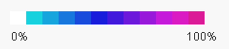
Heatmap Colour Range
Here are the RGB values for your script:
LET vHeatMap1 =rgb(218,26,150);
LET vHeatMap2 =rgb(218,26,195);
LET vHeatMap3 =rgb(197,26,218);
LET vHeatMap4 =rgb(153,25,219);
LET vHeatMap5 =rgb(109,25,219);
LET vHeatMap6 =rgb(64,25,220);
LET vHeatMap7 =rgb(24,29,220);
LET vHeatMap8 =rgb(24,74,220);
LET vHeatMap9 =rgb(23,119,221);
LET vHeatMap10 =rgb(23,165,221);
LET vHeatMap11 =rgb(23,210,222);
LET vHeatMapNull = RGB(255,255,255);
Once you have the variables its a simple process to add these to your chart expression background properites (its also worth noting that QlikView has a ‘Colourmix Wizzard’ which can be found in the expression editor file menu.)
=if($(vExp_MainCalc)=0 ,$(vHeatMapNull)
,if($(vExp_MainCalc)<0.1 ,$(vHeatMap11)
,if($(vExp_MainCalc)>=0.1 and $(vExp_MainCalc)<0.2 ,$(vHeatMap10)
,if($(vExp_MainCalc)>=0.2 and $(vExp_MainCalc)<0.3 ,$(vHeatMap9)
,if($(vExp_MainCalc)>=0.3 and $(vExp_MainCalc)<0.4 ,$(vHeatMap8)
,if($(vExp_MainCalc)>=0.4 and $(vExp_MainCalc)<0.5 ,$(vHeatMap7)
,if($(vExp_MainCalc)>=0.5 and $(vExp_MainCalc)<0.6 ,$(vHeatMap6)
,if($(vExp_MainCalc)>=0.6 and $(vExp_MainCalc)<0.7 ,$(vHeatMap5)
,if($(vExp_MainCalc)>=0.7 and $(vExp_MainCalc)<0.8 ,$(vHeatMap4)
,if($(vExp_MainCalc)>=0.8 and $(vExp_MainCalc)<0.9 ,$(vHeatMap3)
,if($(vExp_MainCalc)>=0.9 and $(vExp_MainCalc)<1 ,$(vHeatMap2)
,$(vHeatMap1)
)))))))))))
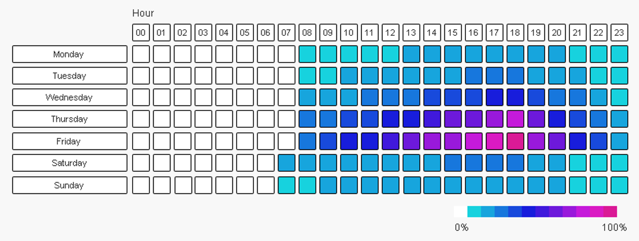
From the inspiration of Dalton Ruer here are two examples that replicate his blog. The first is a simple pivot table, the second uses 150+ text boxes which I think looks better but took a long time to create (and probably isn’t very fast to render across large data sets)

Happy Qliking
Richard
PS – If you view the last chart at full size (by clicking it) you should see dots that appear in the intersection of the squares corners! They don’t exist but I do like optical illusions 🙂

nice piece of information, I had come to know about your internet site from my friend vinay, delhi,i have read atleast 12 posts of yours by now, and let me tell you, your website gives the best and the most interesting information. This is just the kind of information that i had been looking for, i’m already your rss reader now and i would regularly watch out for the new post, once again hats off to you! Thanx a ton once again, Regards,
LikeLike
Thanks for your kind words Navya!
LikeLike
Hi, Thanks for the informative post, If we would like to reduce the heat map color range into three steps rather than 10 steps, How the code needs to be qweaked !!!
For example, for a week, if the minimum value is 50 %, then 50 – 70% in first color, 70-90 % in second color and 90 – 100% in third color…
Thank you in advance
LikeLike